This post serves as a visual, inter a ctive reference guide to help the editor understand exactly how their block choices and layouts adapt across different devices. By viewing this page in both the WordPress Editor and on the live site (using various screen sizes), you can ensure your content remains readable, beautiful, and functional. Use this guide to verify styles for everything from standard text to complex timelines and interactive post grids.
In this Article
1. Semantic Color System
This grid enforces the strict 6-color grayscale architecture. No other colors should exist in the UI outside of 3rd-party exceptions.
Canvas
#ffffff
Global backgrounds, card backgrounds, dark button text.
Ink
#000000
Primary body text, default naked links, structural borders.
Charcoal
#241f31
Headings, site & post titles, paragraph link underlines.
Muted
#77767b
Captions, quotes, hover backgrounds for dark buttons.
Outline
#c0bfbc
Subtle UI borders, default light button backgrounds.
Surface Wash
#ebebeb94
Paragraph link hovers, Query & Details block backgrounds.
2. Link Architecture & Behavior
Testing the “Naked by Default” inheritance rule and paragraph boundaries.
Content Paragraph Links
Because this text is inside a standard paragraph block, links behave as expected for content. Here is a Standard Internal Link, which features a Charcoal underline and a Surface Wash background on hover. In contrast, this is a Standard External Link. Once saved to the frontend, our PHP processor will safely catch it, force it into a new tab, and the CSS will strictly append the SVG icon.
Naked Exceptions (Captions & Buttons)
Images, buttons, and captions sit outside of paragraph tags. They should be completely naked, showing no underlines and no external SVG icons.

Core Typography & Standard Text
The Stylized Drop Cap
This paragraph demonstrates the enhanced drop cap style. Notice how the first letter is significantly larger and uses a specific font weight to draw the reader’s eye into the story. On any screen size, the text will wrap cleanly around this large initial letter, maintaining a professional editorial feel. This is perfect for the opening of a long-form article or a new chapter in a travel story. Please ensure the surrounding text is long enough to showcase the wrapping effect properly.
Centered Quotes
The quote block is center-aligned by default on desktop and tablet screens to create a visual break in the text. However, when viewed on very small mobile phones, the text alignment will automatically switch to left-aligned for better readability. The citation at the bottom is styled to be bold and right-aligned on larger screens to distinguish it from the quote itself. This ensures that your featured wisdom stands out regardless of the reader’s device.
“This is a centered blockquote designed to highlight the most important insights or emotional moments within your articles.”
The Earthstoriez Team
Contextual Link Styles & External Indicators
This paragraph tests how links appear within your content. You can see how a link to an internal page looks compared to a link to an external website. On this theme, external links automatically display a small arrow icon to notify the reader they are leaving the site. If you hover your mouse over any link, the background color will change to a light gray. This visual feedback helps users navigate your stories more intuitively across all devices.
Image Permutations & Media Layouts
To deliver the images in a performant way follow the following use cases.
This section demonstrates how images of various sizes interact with your text when aligned to the left. Understanding the relationship between image scale and text wrapping is key to creating professional, magazine-style layouts that feel intentional and balanced. You will see how the theme automatically manages the width of these elements so your stories remain highly readable on both large desktop monitors and small handheld screens.
Image captions
This section showcases the standardized caption format for editorial compliance. In the caption below the image, we include the Title, author, source, and the CC BY 4.0 License. Notice how the links in the caption are colored with the theme’s primary accent to remain subtle yet accessible. On mobile phones, the caption text remains perfectly centered and adjusts its width to match the image, ensuring the legal attribution is always readable. Hover your mouse over the links to see them change color, confirming they are active and functional for your readers.
left/right Aligned Thumbnail


Here we have a left aligned low resolution, and right aligned high resolution thumbnail. On larger screens, the image stays within the right margin while the text wraps around its left side. The real difference is noticeably on mobile screens, where the browser choose a higher resolution of the right thumbnail. This variety in placement helps keep the reader engaged by breaking up the visual rhythm of the page. Even on smaller mobile screens, the image maintains its proportions without pushing the text too far out of view.
left/right Aligned Images use cases

To have images displayed on the side on desktops, centered on tablets and mobile phones use align them right/left and choose the medium size in the image block settings.
Uploads should be at least 1600 pixels wide, as mobile devises with a device pixel ratio of 3 will pull in the 1536 width.
The image will be displayed with a maximum width of 470 pixels, or use at the most 45% of the contend width.
Note: If the image is set size is set to large or full size the browser will download higher resolutions as necessary

A medium-sized aligned image aligned to the right provides a balanced visual break in your article. When viewed on a desktop, the image is capped at 45% of the page and restrained to a width of 470 pixels, allowing the text to wrap elegantly around its left side. However, on a tablet, this image will automatically jump above the text and center itself to prevent the layout from feeling cramped. Once the screen shrinks further to a mobile phone, the image expands to full-width, loses its rounded corners, and touches the very edges of the screen for a bold, immersive look.
left/right Aligned Large Image
This example demonstrates a large image aligned to the left, which is perfect for high-resolution travel photography. On a desktop screen, the image is higher in width but still capped at 45% of the page so that your test is still visible to the right. As the reader switches to a tablet, the image breaks away from the text and moves above to a centered, standalone position. On mobile devices, the image becomes a full-bleed element, stretching from the left edge to the right edge of the phone to give your photos maximum screen real estate.
Low resolution images bellow 800w

The theme treats low resolution images differently, they are restrained form extending over their resolution which has implications for the layout. Low resolution images will never extend to full width, on lower screen they will center them self and might cheep margin on certain screen widths.

This example demonstrates a large image aligned to the left, which is perfect for high-resolution travel photography. On a desktop screen, the image is higher in width but still capped at 45% of the page so that your test is still visible to the right. As the reader switches to a tablet, the image breaks away from the text and moves above to a centered, standalone position. On mobile devices, the image becomes a full-bleed element, stretching from the left edge to the right edge of the phone to give your photos maximum screen real estate.
Centered images
low res images align wide, full size. image is not allowed to stretch to wide size it is constrained to its original size
low res image align full width, full size. image is not allowed to stretch to full width, only its constrained to its original size.
low res image align center, full size, image is already constrained by WordPress defaults
low res images align wide, medium size. image is not allowed to stretch to wide size it is constrained to its original size

low res image align full width, medium size. image is not allowed to stretch to full width, only its constrained to its original size.
low res image align center width, medium size. image is already constrained by WordPress,
low res image align center, thumbnail.
small images
large images
Full size images
This example demonstrates a large image aligned to the left, which is perfect for high-resolution travel photography. On a desktop screen, the image is higher in width but still capped at 45% of the page so that your test is still visible to the right. As the reader switches to a tablet, the image breaks away from the text and moves above to a centered, standalone position. On mobile devices, the image becomes a full-bleed element, stretching from the left edge to the right edge of the phone to give your photos maximum screen real estate.
This example demonstrates a large image aligned to the left, which is perfect for high-resolution travel photography. On a desktop screen, the image is higher in width but still capped at 45% of the page so that your test is still visible to the right. As the reader switches to a tablet, the image breaks away from the text and moves above to a centered, standalone position. On mobile devices, the image becomes a full-bleed element, stretching from the left edge to the right edge of the phone to give your photos maximum screen real estate.
This example demonstrates a large image aligned to the left, which is perfect for high-resolution travel photography. On a desktop screen, the image is higher in width but still capped at 45% of the page so that your test is still visible to the right. As the reader switches to a tablet, the image breaks away from the text and moves above to a centered, standalone position. On mobile devices, the image becomes a full-bleed element, stretching from the left edge to the right edge of the phone to give your photos maximum screen real estate.
asdf
Aligned images

This is a thump nail image, it should align next the the text. In the vast exp anse of the cosmos, on the outskirts of the Saturnian system, a peculiar phenomenon unfolded. The derelict remnants of an ancient civilization floated aimlessly, their metallic shells whispering secrets of forgotten technologies. A lone explorer, clad in a sleek silver suit, ventured into the void, guided by the enigmatic allure of these celestial relics. As the explorer delved deeper into the ethereal abyss, the stars seemed to dance to an otherworldly symphony, their cosmic melodies resonating with the explorer’s very soul.
Text to prevent image collision. In the vast expanse of the cosmos, on the outskirts of the Saturnian system, a peculiar phenomenon unfolded. The derelict remnants of an ancient civilization floated aimlessly, their metallic shells whispering secrets of forgotten technologies.
This is a thump nail image, it should align next the the text. This one is resized. In the vast expanse of the cosmos, on the outskirts of the Saturnian system, a peculiar phenomenon unfolded. The derelict remnants of an ancient civilization floated aimlessly, their metallic shells whispering secrets of forgotten technologies. A lone explorer, clad in a sleek silver suit, ventured into the void, guided by the enigmatic allure of these celestial relics. As the explorer delved deeper into the ethereal abyss, the stars seemed to dance to an otherworldly symphony, their cosmic melodies resonating with the explorer’s very soul.
Text to prevent image collision. In the vast expanse of the cosmos, on the outskirts of the Saturnian system, a peculiar phenomenon unfolded. The derelict remnants of an ancient civilization floated aimlessly, their metallic shells whispering secrets of forgotten technologies.

This is an image, it should align next the the text. Only medium sized images align on the side. Right aligned images stack on top, on smaller view-ports. In the vast expanse of the cosmos, on the outskirts of the Saturnian system, a peculiar phenomenon unfolded. The derelict remnants of an ancient civilization floated aimlessly, their metallic shells whispering secrets of forgotten technologies. A lone explorer, clad in a sleek silver suit, ventured into the void, guided by the enigmatic allure of these celestial relics. As the explorer delved deeper into the ethereal abyss, the stars seemed to dance to an otherworldly symphony, their cosmic melodies resonating with the explorer’s very soul.
Text to prevent image collision. In the vast expanse of the cosmos, on the outskirts of the Saturnian system, a peculiar phenomenon unfolded. The derelict remnants of an ancient civilization floated aimlessly, their metallic shells whispering secrets of forgotten technologies.
Gallery
This is a simple gallery. In the vast expanse of the cosmos, on the outskirts of the Saturnian system, a peculiar phenomenon unfolded. The derelict remnants of an ancient civilization floated aimlessly, their metallic shells whispering secrets of forgotten technologies. A lone explorer, clad in a sleek silver suit, ventured into the void, guided by the enigmatic allure of these celestial relics. As the explorer delved deeper into the ethereal abyss, the stars seemed to dance to an otherworldly symphony, their cosmic melodies resonating with the explorer’s very soul.


In the vast expanse of the cosmos, on the outskirts of the Saturnian system, a peculiar phenomenon unfolded. The derelict remnants of an ancient civilization floated aimlessly, their metallic shells whispering secrets of forgotten technologies. A lone explorer, clad in a sleek silver suit, ventured into the void, guided by the enigmatic allure of these celestial relics. As the explorer delved deeper into the ethereal abyss, the stars seemed to dance to an otherworldly symphony, their cosmic melodies resonating with the explorer’s very soul.
← Keep exploring →
Keep exploring:
-
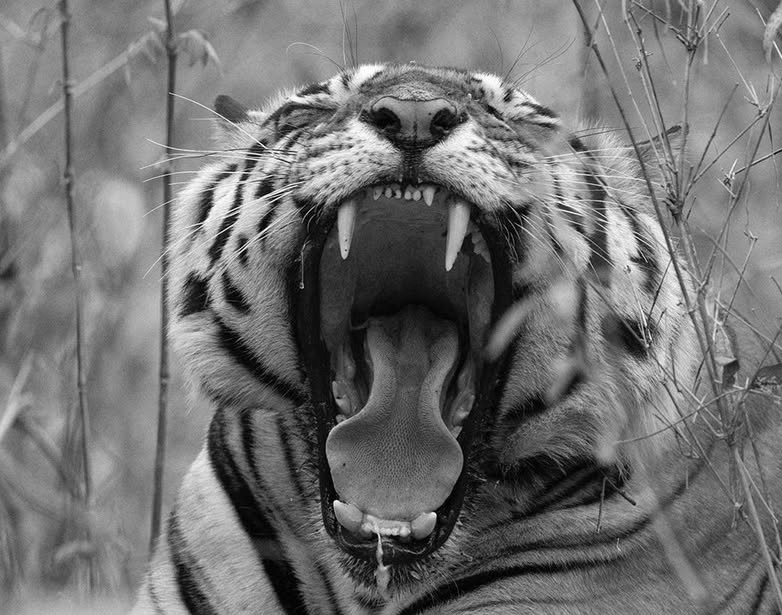
INDIA: On History, Myth & Folklore of the Bengal Tiger
Tiger, Tiger! Tigers are deeply embedded in the cultural and natural heritage of India. They feature prominently in Mughal history and Hindu, Jain, Sikh and Buddhist thought and are associated with deities, royals and epic stories. Their symbolism extends to various aspects of Indian heritage: mythology, folklore and art, as well as religious practices. Discover…
-

The curative use of tiger products in history and heritage of India and Asia
Discover the use of tiger parts and products in history and heritage of medical practices of Ayurveda, ethnic groups of India and in traditional Asian medicine. ETHNOMEDICINE: The use of tiger products in history and heritage of traditional Indian medicine The study of how people of a particular culture and region interact and use tiger…
-
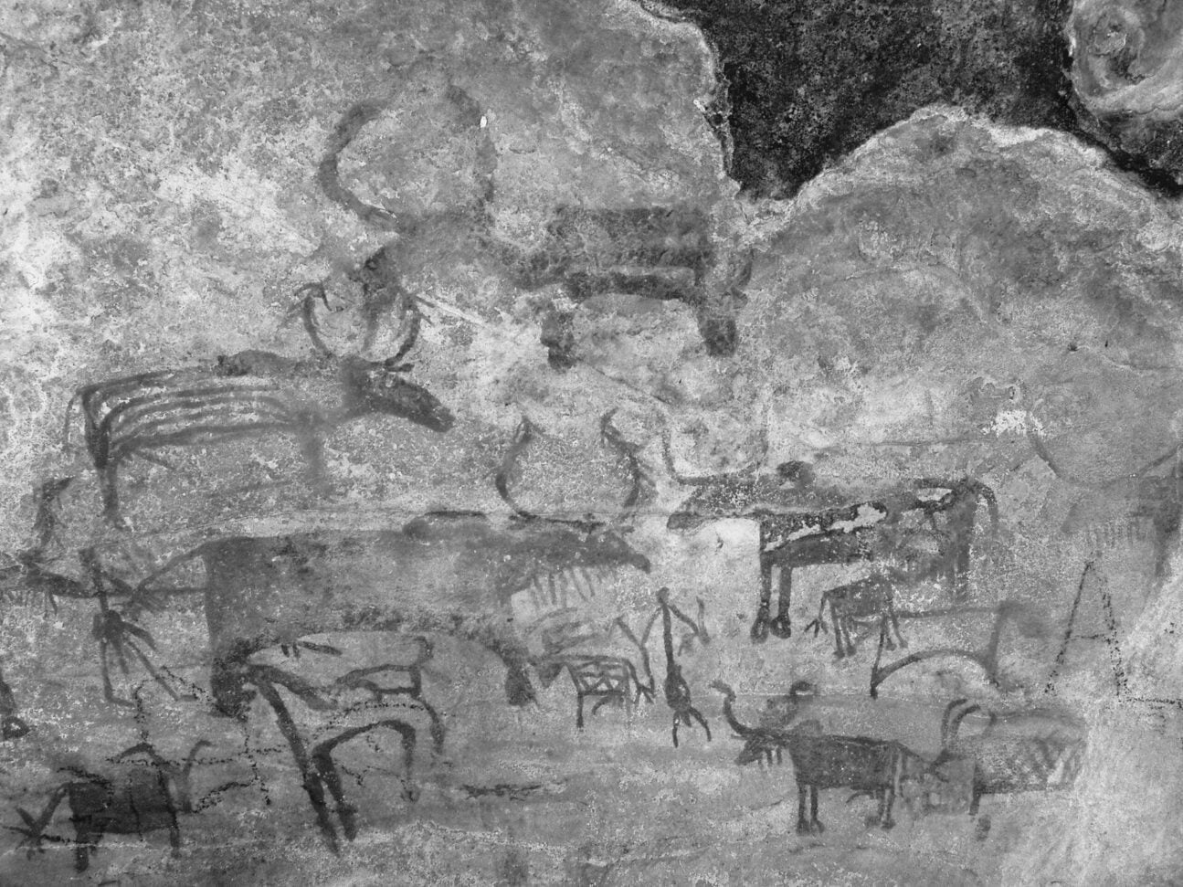
A short history of the domestication of the cow and bull in India
Discover a short history of the domestication of the cow and bull in India, from the Aurochs to the Zebu. Aurochs Archaeologists and biologists are agreed that there is strong evidence for two distinct domestication events from aurochs: Bos taurus in the near east about 10,500 years ago, and Bos indicus in the Indus valley…
-
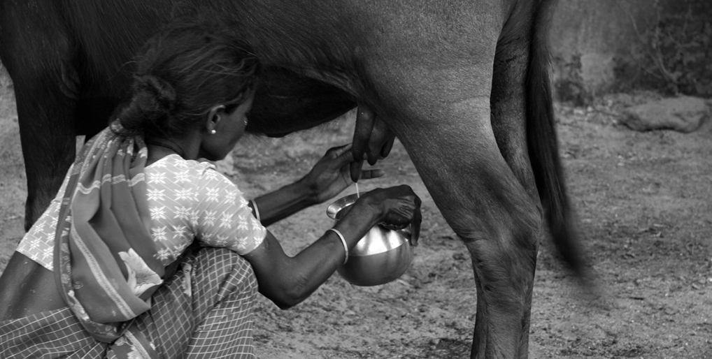
The curative use of cow products in history and heritage of India
Discover the use of cow products, like milk, ghee, urine and dung in history and heritage of traditional Indian medicine, Ayurveda and daily life. ETHNOMEDICINE: The use of cow products in history and heritage of traditional Indian medicine, Ayurveda and daily life The study of how people of a particular culture and region interact and…
-

INDIA: On Cow and Bull in history & mythology
Discover India’s cow and bull in History, Mythology and farmers life. Explore the varied meanings of the Sanskrit word Go गो and the many goddesses and gods related to cow and bull. On the go – cows and bulls on Indian roads On the bike staying focused is key. Traffic moves like water down a…
-
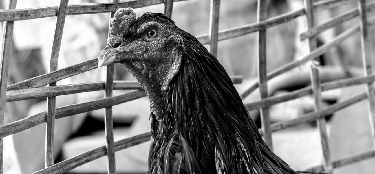
INDONESIA: Traditional Tajen- Cockfighting in Bali
Indonesia, like many other nations, has banned cock fighting as a cruel sport, although traditional Tajen– Cockfighting in Bali is still allowed for ceremonial purposes. The term bali refers to blood offerings and/or animal sacrifice. These fighting birds are as much a part of Balinese Hindu rites as the burning of incense and giving offerings…
-
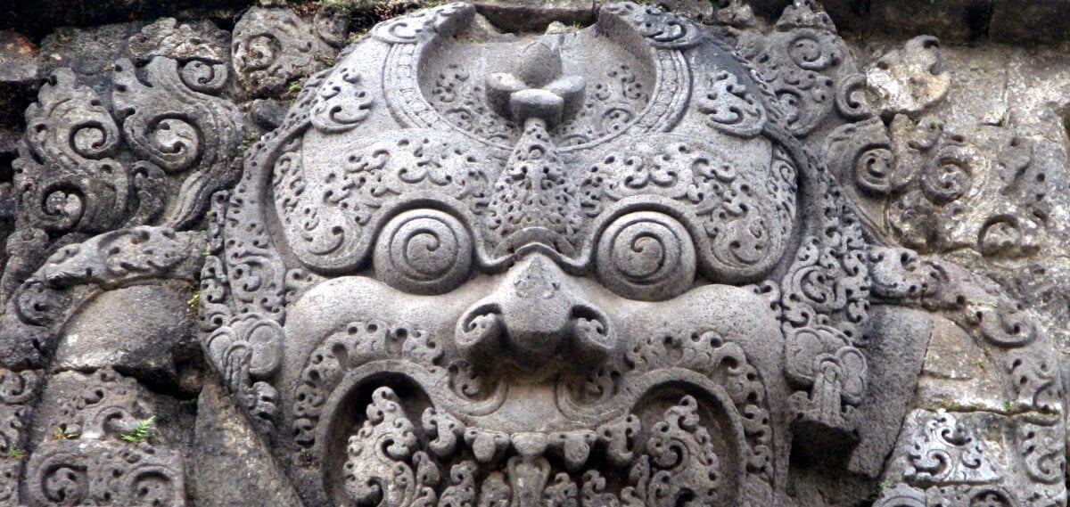
INDONESIA: On animal sacrifices in Bali and the mythological origins
The tradition of animal sacrifices in Bali and the mythological origins source from the records in palm-leafs and Hindu literature. Animal sacrifice or bali in Sanskrit, exist in almost all cultures. From Hebrews to Greeks and Romans (Lustratio), Ancient Egyptians (the cult of Apis) and from the Aztecs to the Yoruba. These sacrificial rituals are…